
Refining the KnowledgePoint prototype


Work on the KnowledgePoint platform has focussed recently on creating an improved experience for the user. We initially aimed to build a proof of concept prototype. Having done so, it has become clear that the most important thing that can happen would be to improve the look and feel of the site, how someone interacts with it, to meet both expectations of experienced web users and clarity for newer web users.
Over an intensive two week period working with Aptivate, a number of design improvements were identified, and a prioritised selection of recommendations will be implemented by our main developers.
Continuing a theme of sharing processes and experiences that may be of interest to other innovation projects, this blog post briefly outlines how these design improvements were identified.
User personas The first stage of the redesign process involved the development of three ‘personas’ – imaginary but representative users – who captured the core requirements of the system. The users were: someone with deep expertise from an academic institution; someone who volunteers for an agency to help handle existing enquiries; and a person who works in a national-level partner organisation as an engineer.
The exercise suggested the needs of these people would encompass many of the needs of more traditional actors – one of the aims of using user personas is to rationalise the number of needs you are trying to meet. Later, our project will focus more on the specific and more demanding challenges that humanitarian actors face.
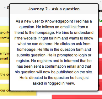
User stories and user journeys A number of ‘user stories’ were developed for each of these personas, describing not only how they would like to use the system, but where and when they would use KnowledgePoint, what their goals or concerns might be, their relationship with technology, and many other factors.
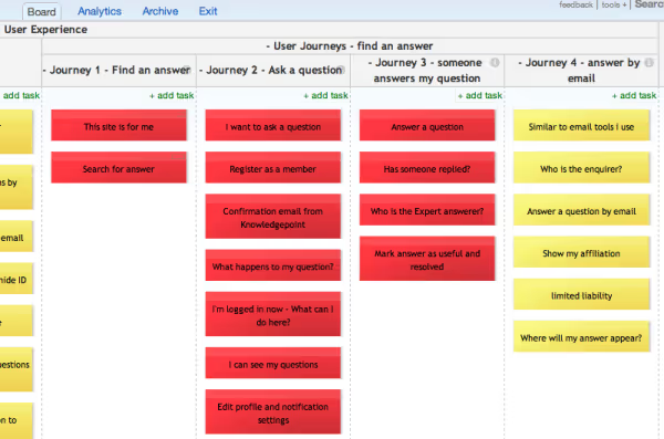
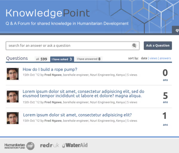
To create ‘user journeys’, we took some key tasks that a user may need to carry out – essentially an output and a workflow to get there. The user journeys are simplified to one title, such as ‘ask a question’, but encompass the several steps involved, shown here:
The image below shows how we captured this. The four columns each represent a user journey. Within each column is a number red or yellow cards (a virtual post-it note or file card) representing a story. In the software we are using, you can then click on each card and see more details about the story. The software is KanbanTool, who have very kindly donated a license to the KnowledgePoint project.
The cards can be moved around vertically to change the priority in which you will address them, and similarly, the next step will be to move the individual cards horizontally into an ‘in progress’ column – where our developers will turn the stories into usable features.
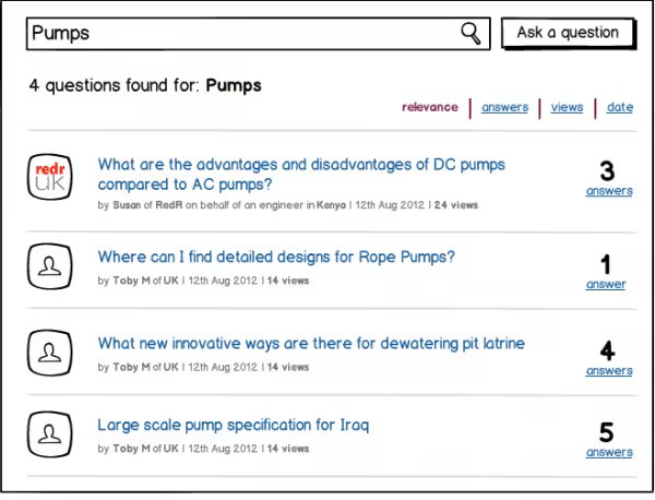
Attached to each card is a mock-up of what the screen might look like when a user is at that point in a journey. The screen wireframe uses a tool we have used previously called Balsamiq, and also a standard design package. An example of the screenshot for the story ‘search for an answer’ is below, first as a wireframe…
...and also as a more illustrative mock-up:
Stay updated
Sign up for our newsletter to receive regular updates on resources, news, and insights like this. Don’t miss out on important information that can help you stay informed and engaged.

Related articles


Explore Elrha
Learn more about our mission, the organisations we support, and the resources we provide to drive research and innovation in humanitarian response.